Designed an Investor Decision Flow for an Early-Stage Nonprofit
Averaging 1.75 pages per user and generating 300+ interactions across investor-critical pages
Overview
Role
Lead Product Designer
Team
I collaborated with a talented team of UX researchers, UX designers, a project manager, & a developer, while working closely with the founder, Beulah Osueke.
Timeline
3 months
Project type
B2B Product Design, Investor-Facing Website Redesign (IA, UX, UI, Content)
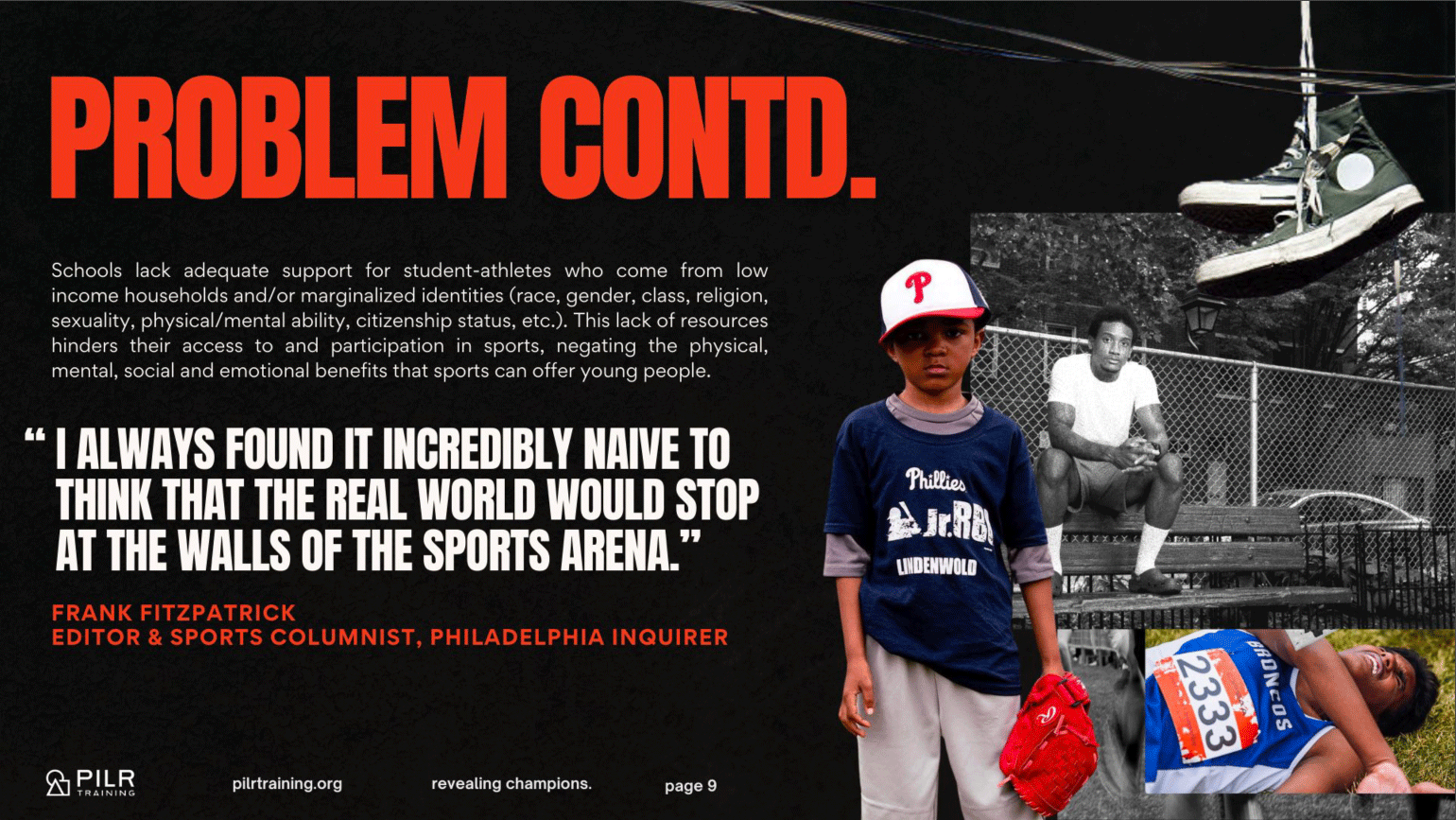
Problem
PILR Training, an early-stage nonprofit, was preparing for a February 2025 investor outreach. However, PILR’s website did not reflect its updated business strategy, limiting investors’ ability to evaluate the organization.
Solution
I led the end-to-end redesign of PILR’s website by restructuring the site architecture & investor flow, defining key evaluation criteria, & guiding a team to deliver a cohesive, responsive experience.
Impact
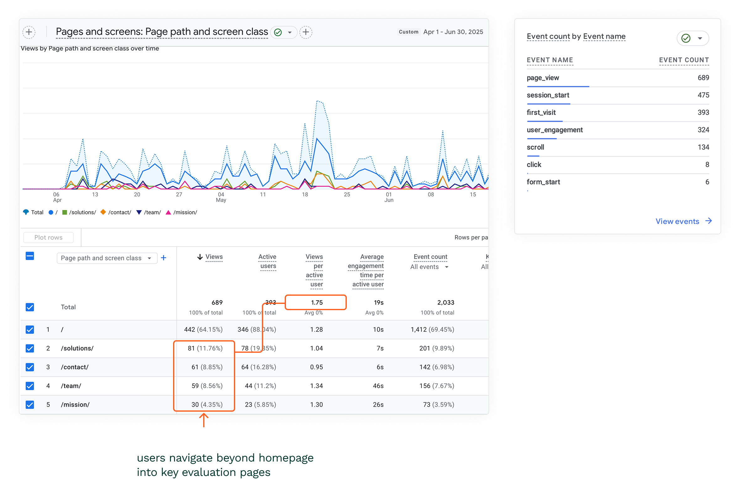
Within the first 3 months, users progressed beyond the homepage into key evaluation pages, generating 300+ engagement events & averaging 1.75 pages per user. Early form interactions indicated movement toward investor action, & the site launched in time for February outreach.
About
PILR Training: Building a Network of Coaches to Drive Social Change through Sports.
PILR Training is an early-stage nonprofit that equips high school coaches with training & programming to support athletes facing mental, emotional, & systemic challenges.
As the organization prepared for investor outreach, its website needed to clearly communicate its model, impact, & funding needs to potential investment partners.

USER BEHAVIOR
Investors Use Websites to Evaluate Credibility and Investment Potential.
User interviews revealed that investors use websites to quickly assess what an organization does, how it works, & whether it’s worth funding. If key information is unclear or difficult to assess, they exit the decision process.
“Website first, then I learn about who they are & their story.”
- Quote from User Interview
“I look at the organization’s website, any reports they have, any strategy documents.”
- Quote from User Interview
EXPERIENCE GAPS
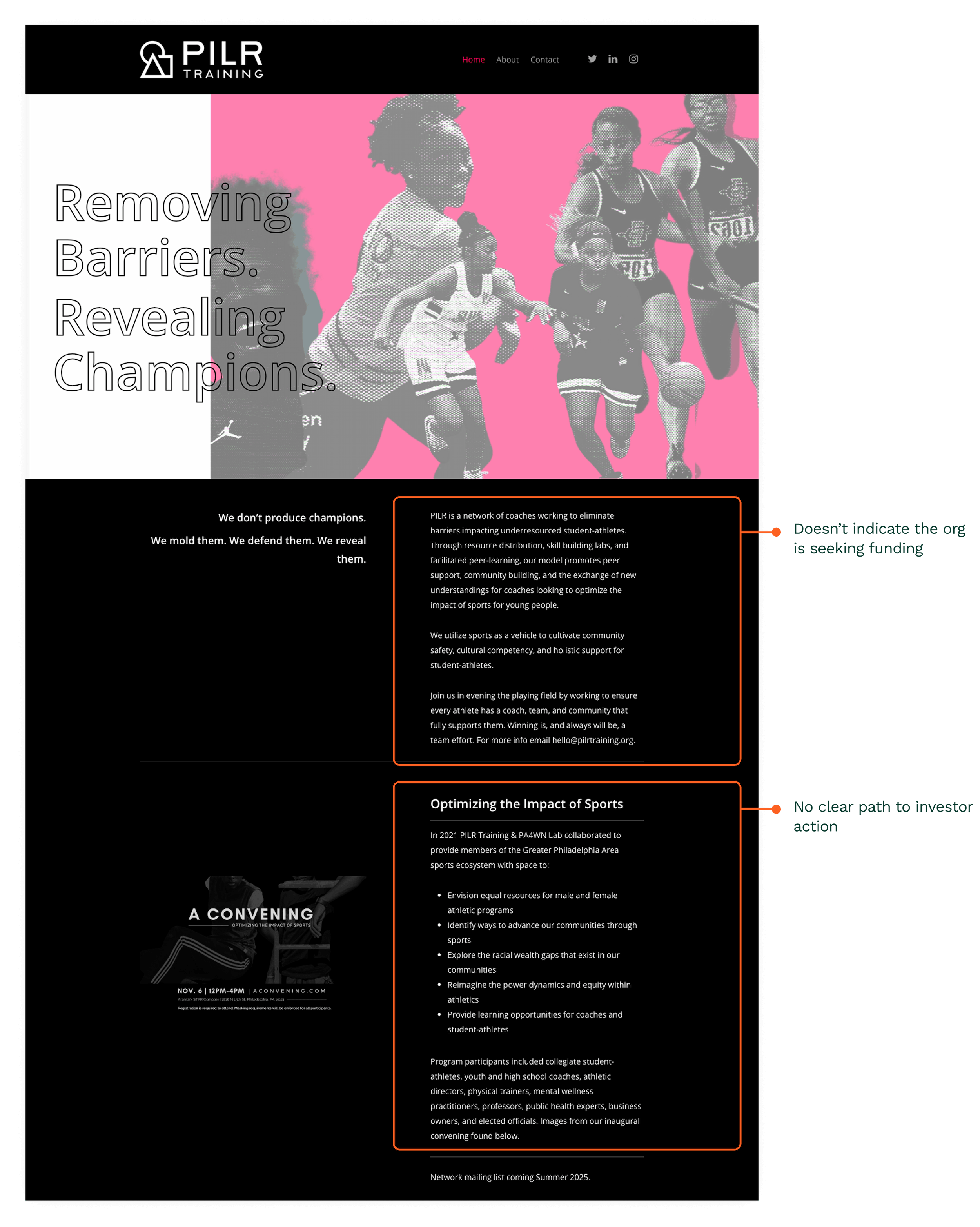
PILR’s Website Did Not Support Funding or Investor Evaluation.
My audit revealed that the site did not clearly communicate PILR’s goal of seeking funding & lacked critical information (model, impact, roadmap, financials), blocking investment opportunities.
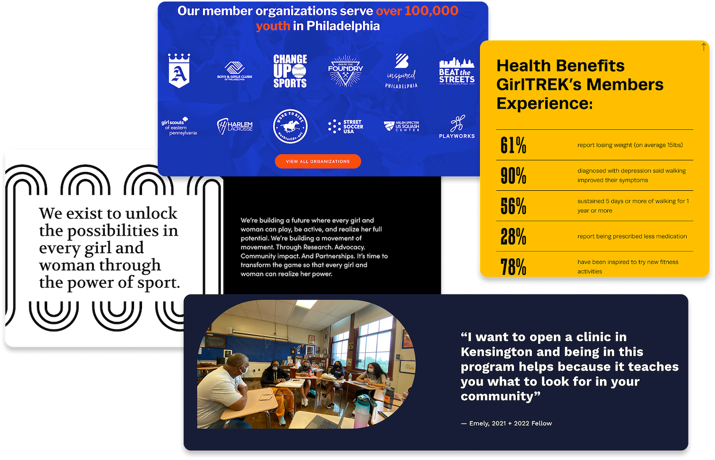
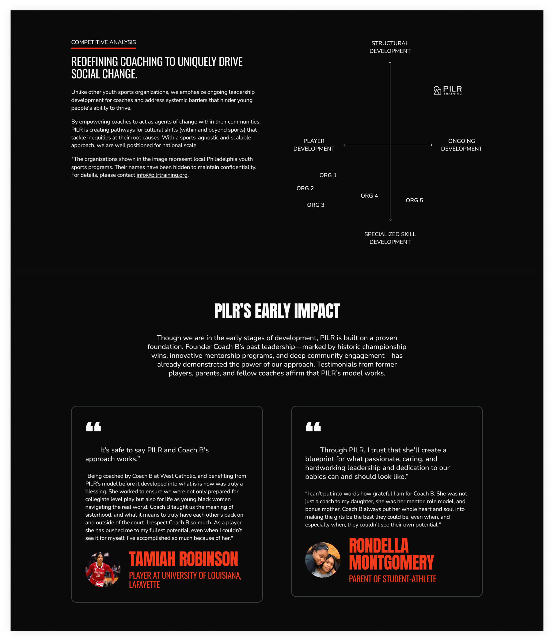
COMPETITIVE BENCHMARK
Funded Organizations Use Structured Content and Credibility Signals to Support Investment Decisions.
Funded organizations consistently communicate their value proposition, operating model, & funding needs through content, credibility signals (metrics, testimonials, partnerships), & a clear path to investor action.
💡 Investors needed a clear indication that PILR was seeking funding, & key information to make an investment decision.
DEFINING STRATEGY
Designing for Investor Decision-Making Under Constraints.
With 1 developer, & a 3-month investor outreach deadline, I prioritized a focused update to the existing site, creating a UX roadmap & aligning cross-functional work through weekly reviews.
The client initially prioritized animations & rich interactions. Grounded in user research, I shifted the focus to investor-critical information over visual complexity, deferring animations to a later phase.
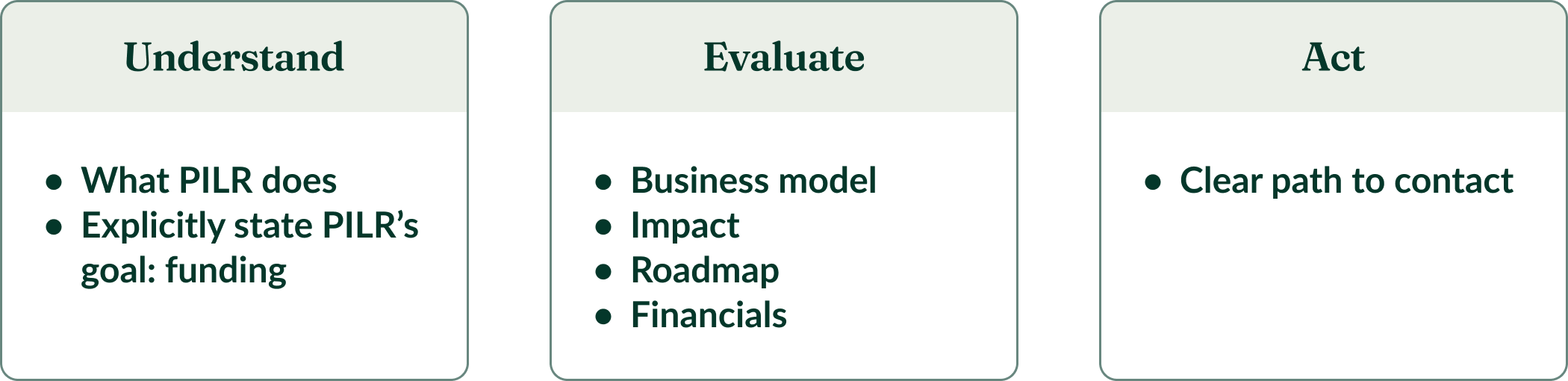
Investor Decision Flow
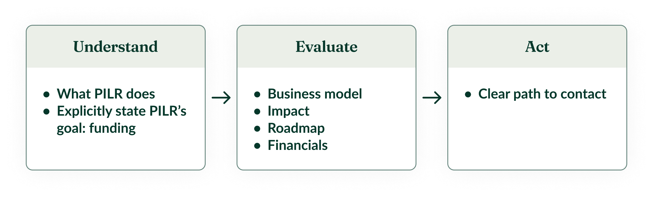
Design Team Goals
Surface key investor information quickly without additional navigation
- Structure the experience to support how investors assess opportunities, from understanding → evaluation → action
- Enable a clear path to investor action
- Align the experience with the February 2025 investor outreach timeline
EXPLORATION & KEY DECISION POINTS
Exploring Approaches to Support Investor Evaluation.
I explored 3 approaches to deliver investor-critical information.
Prioritization Matrix
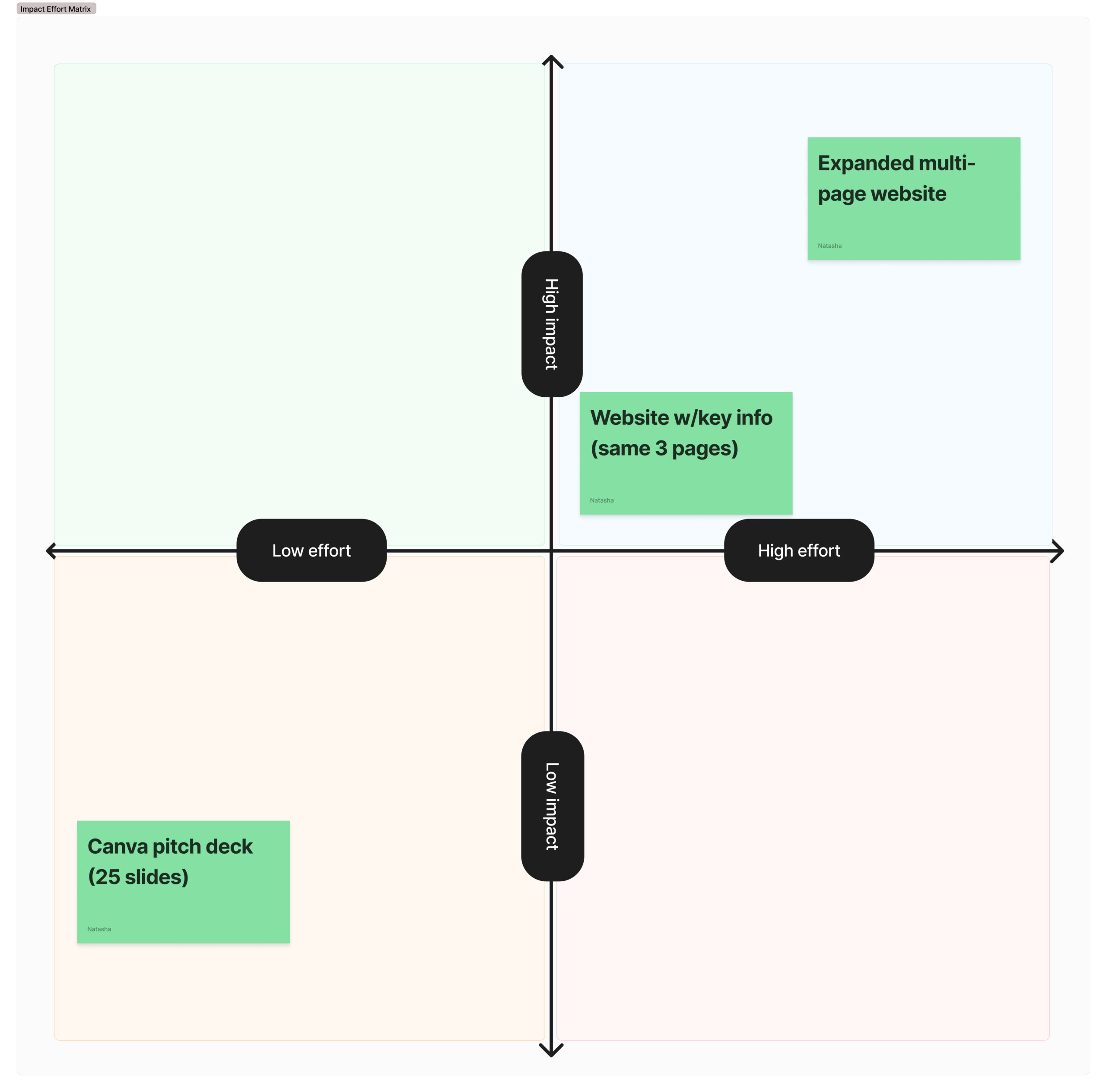
❌ Canva pitch deck
Fastest to ship, but limits engagement & perceived credibility
✅ Website with key information, same 3-page structure
Centralizes key info, but risks increased cognitive load within a condensed structure
❌ Expanded multi-page website
Improves discoverability, but not feasible within timeline constraints (feasability assumed w/no dev at this time)
💡 I moved forward with a 3-page approach to centralize information into a single web experience, enabling independent investor evaluation within timeline constraints.
EXPLORATION & KEY DECISION POINTS
Testing Progressive Disclosure to Manage Information Density.
To reduce cognitive load within the 3-page structure, my team & I introduced progressive disclosure through dropdowns.
Usability testing revealed that investors didn’t interact with dropdowns, leaving critical information hidden.
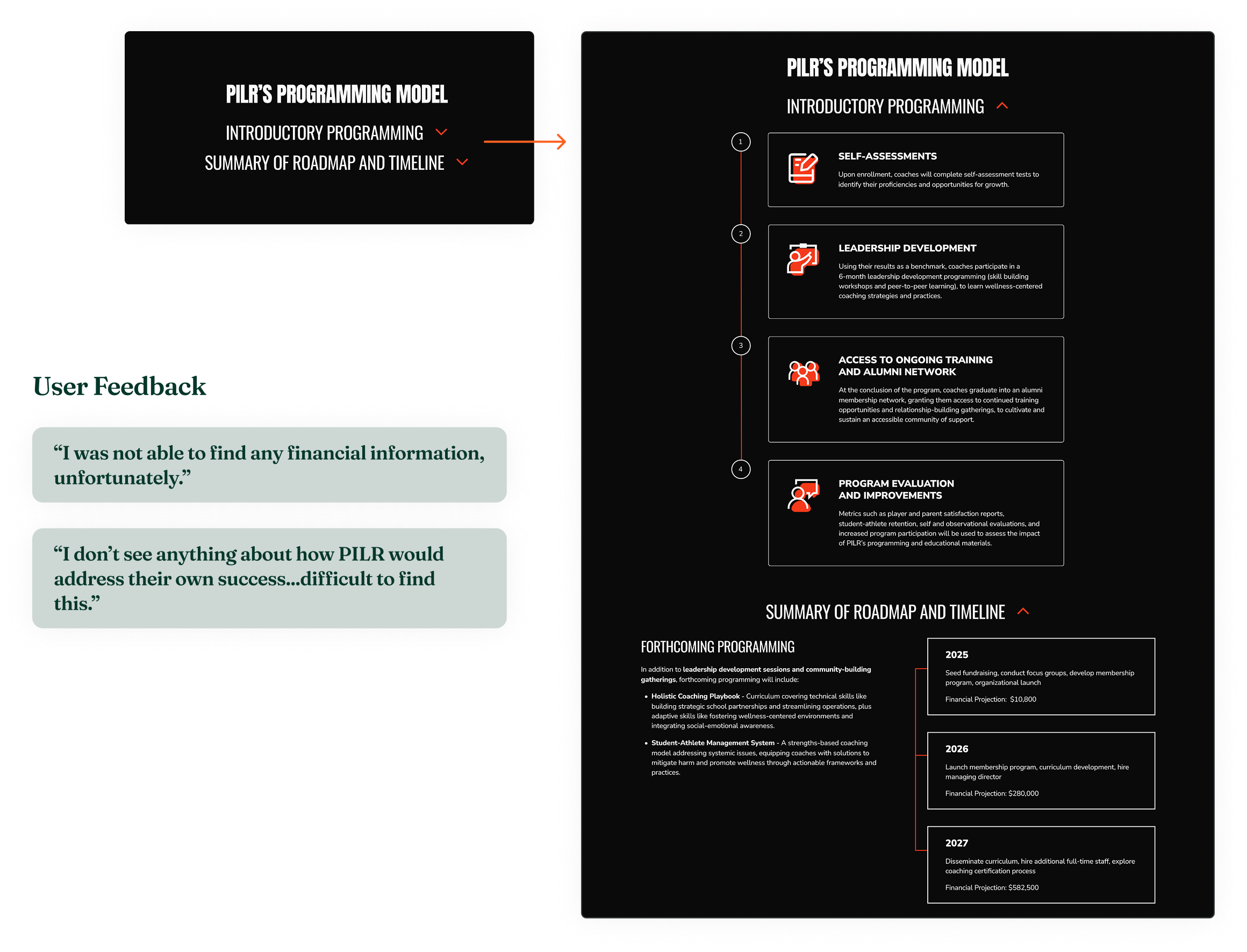
EXPLORATION & KEY DECISION POINTS
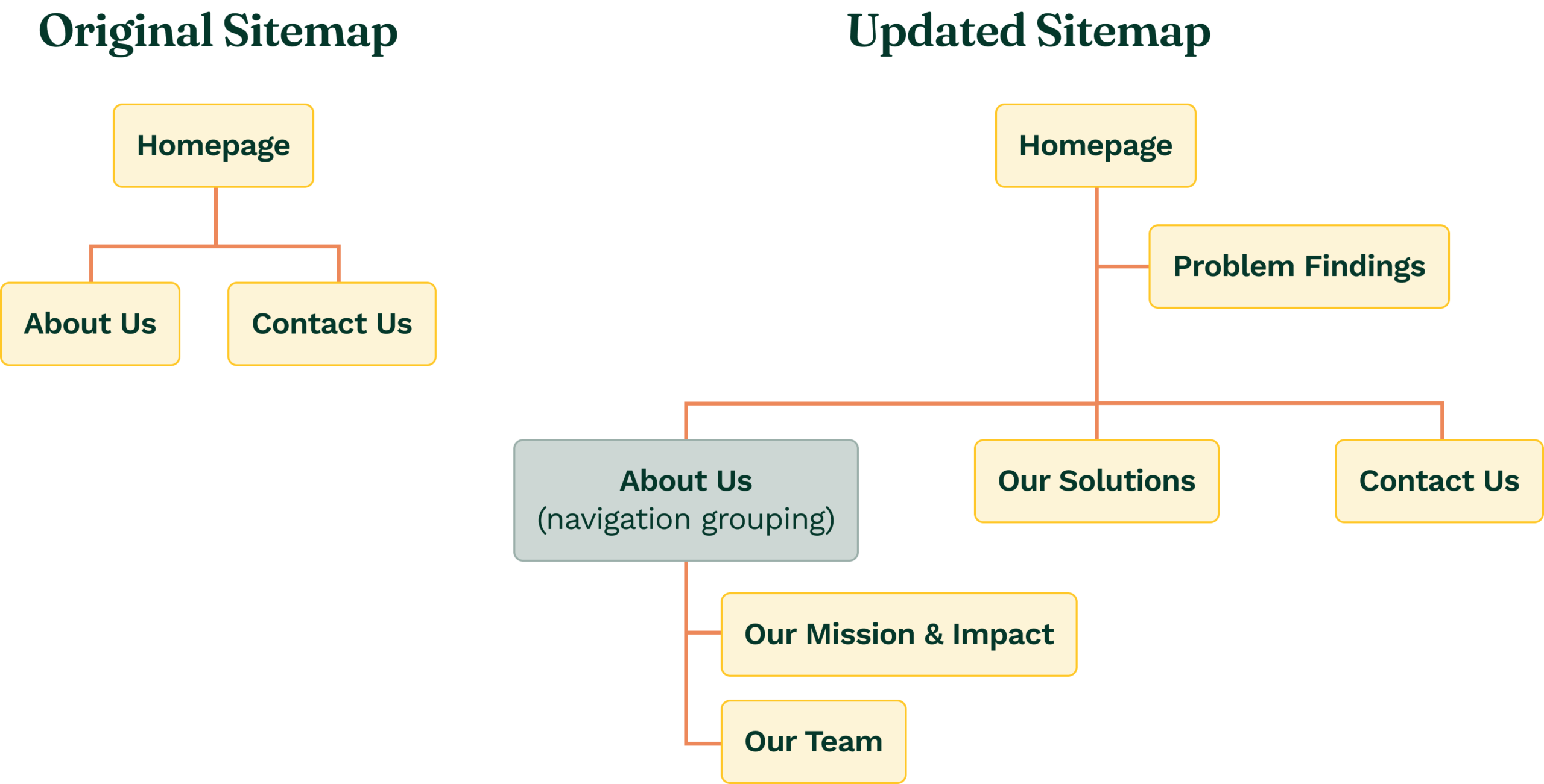
Pivot: Expanding from 3 to 6 Pages to Support Evaluation.
Testing showed that critical information was missed due to content density & structure, not just hidden interactions.
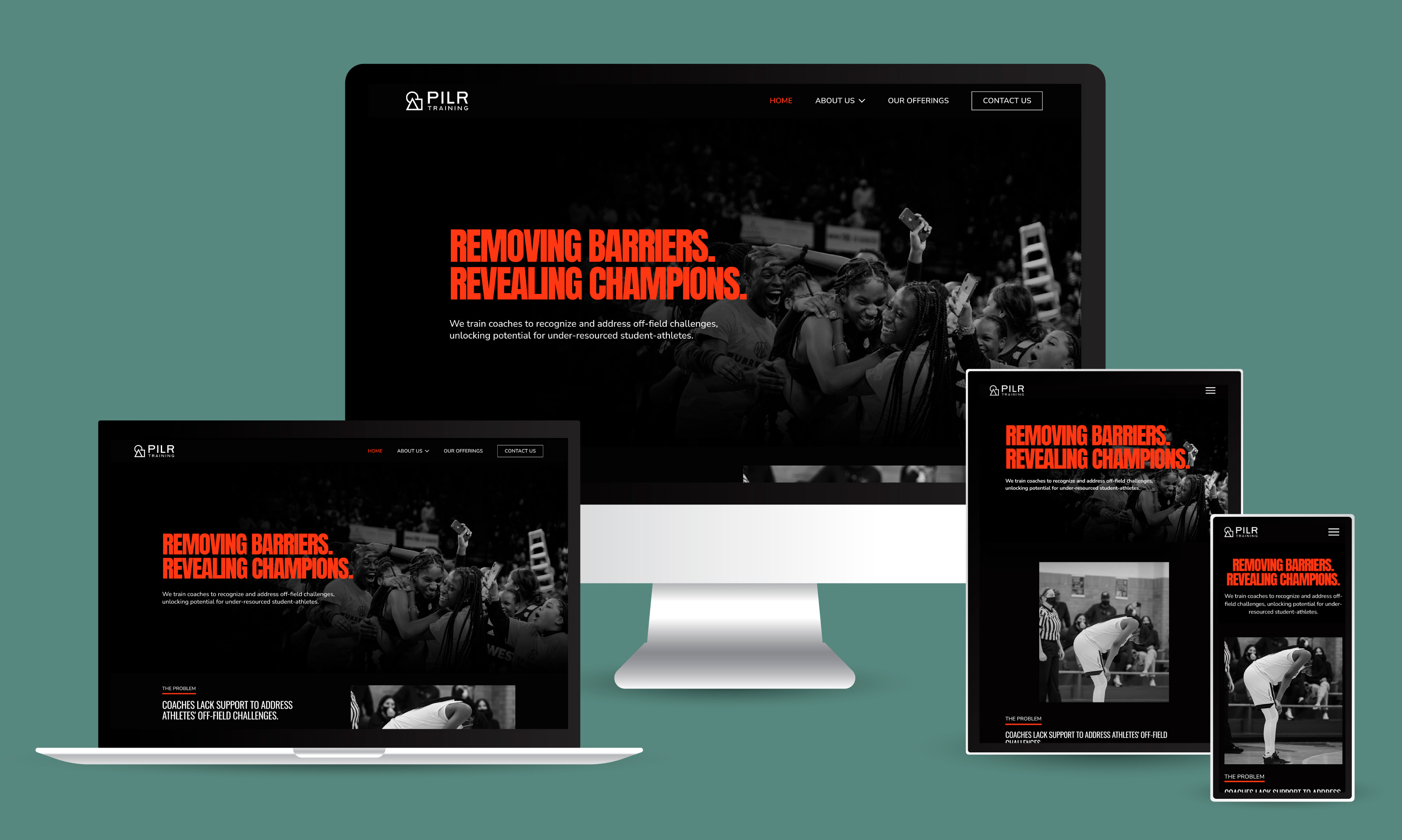
After confirming feasibility with engineering, I expanded the structure from 3 to 6 pages to improve discoverability & reduce cognitive load while meeting the deadline.
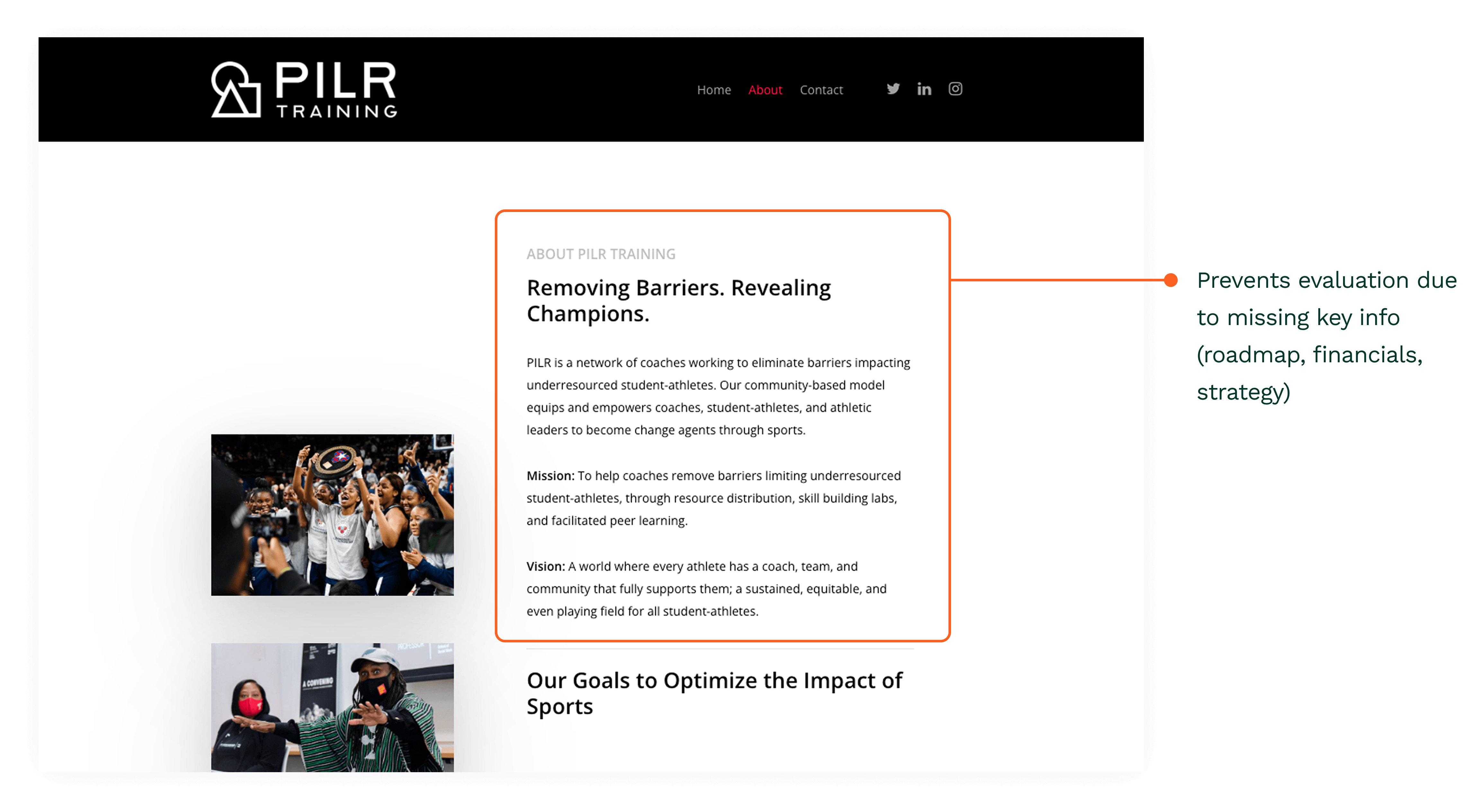
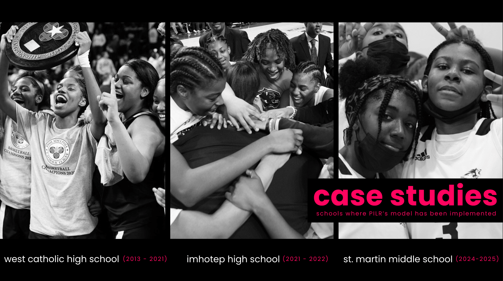
Original About Us Page
Key info buried & missed
Updated About Us Page
- Split into 3 pages: Our Mission & Impact, Our Team, & Our Solutions
- Key investor info surfaced directly
- Hidden interactions → now visible info
EXPLORATION & KEY DECISION POINTS
Balancing Visual Direction, Brand, and Timeline.
Midway through the project, the client updated the pitch deck’s visual direction.
I proposed 3 levels of alignment & recommended a medium approach to balance brand consistency with the fundraising timeline, to which the client agreed.
Old Deck Design
New Deck Design

Proposed Site Changes
Light Changes
Medium Changes*
(recommended option)
Heavy Changes
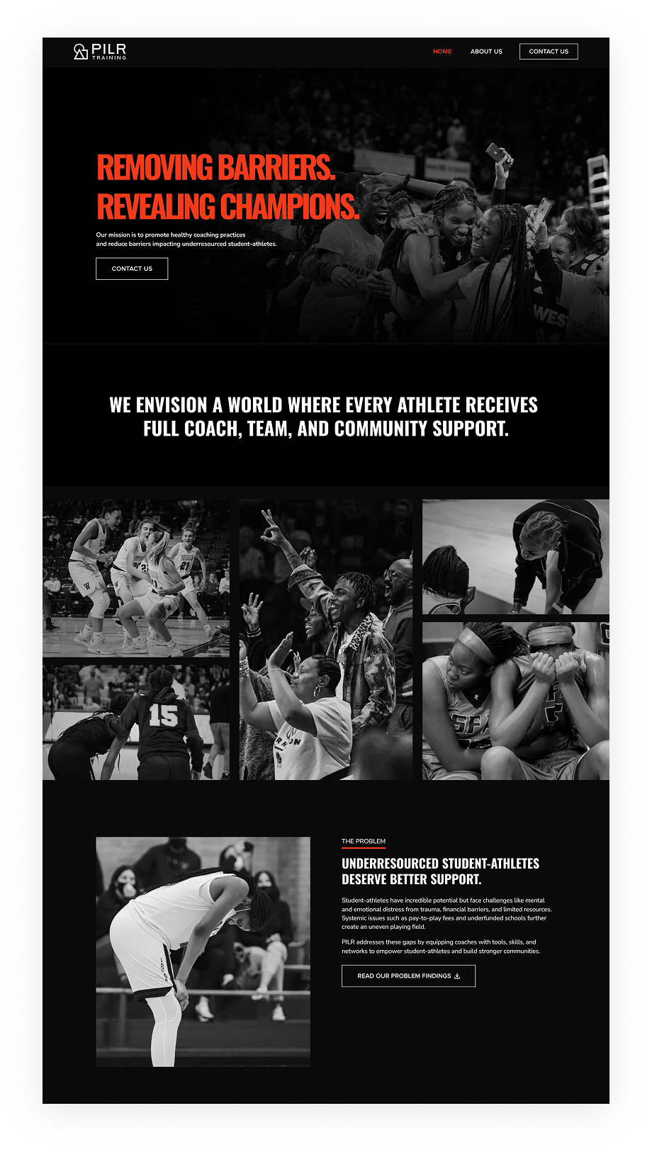
FINAL DESIGN
Investor Decision Flow
Understand
Homepage communicates what PILR does & it’s funding goal, allowing investors to quickly determine relevance
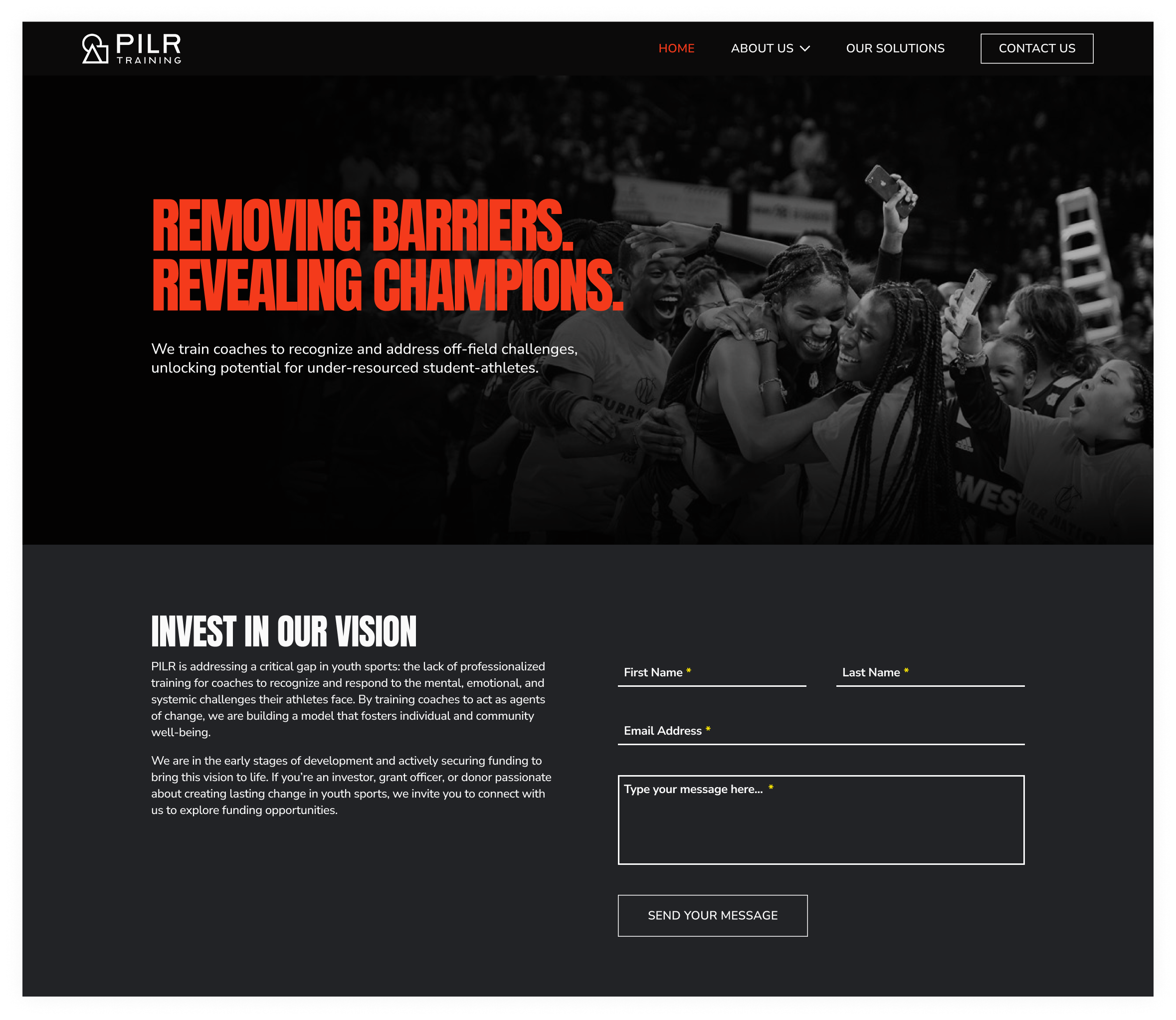
Evaluate
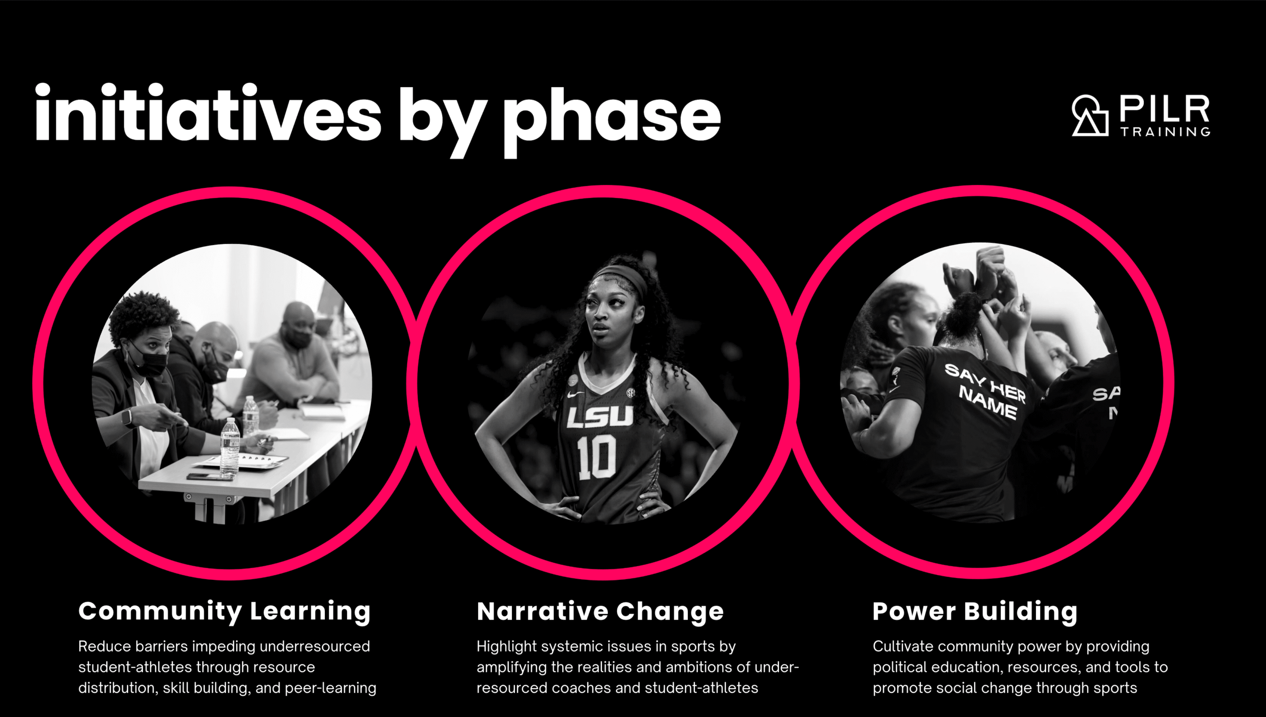
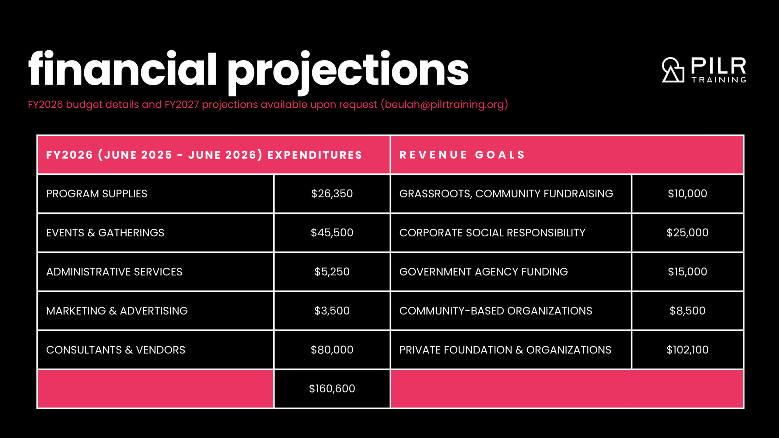
Key evaluation criteria (PILR’s model, impact, roadmap, financials) are separated across dedicated pages w/supporting signals that reinforce credibility & value

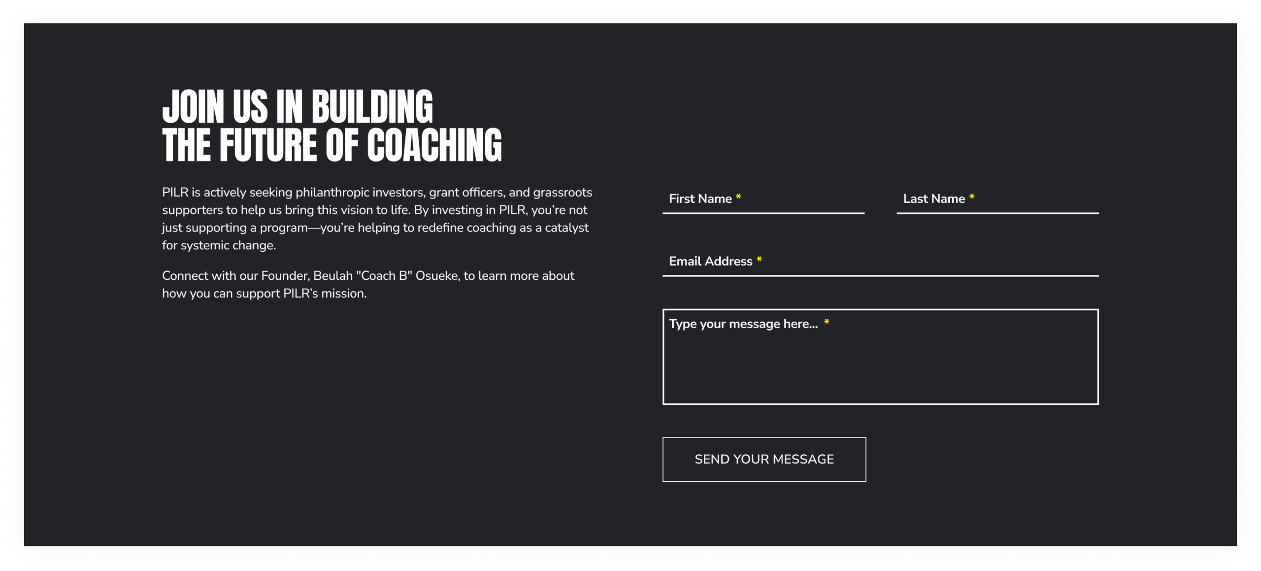
Act
A CTA is positioned after key evaluation points across pages w/a simple contact flow to reduce friction
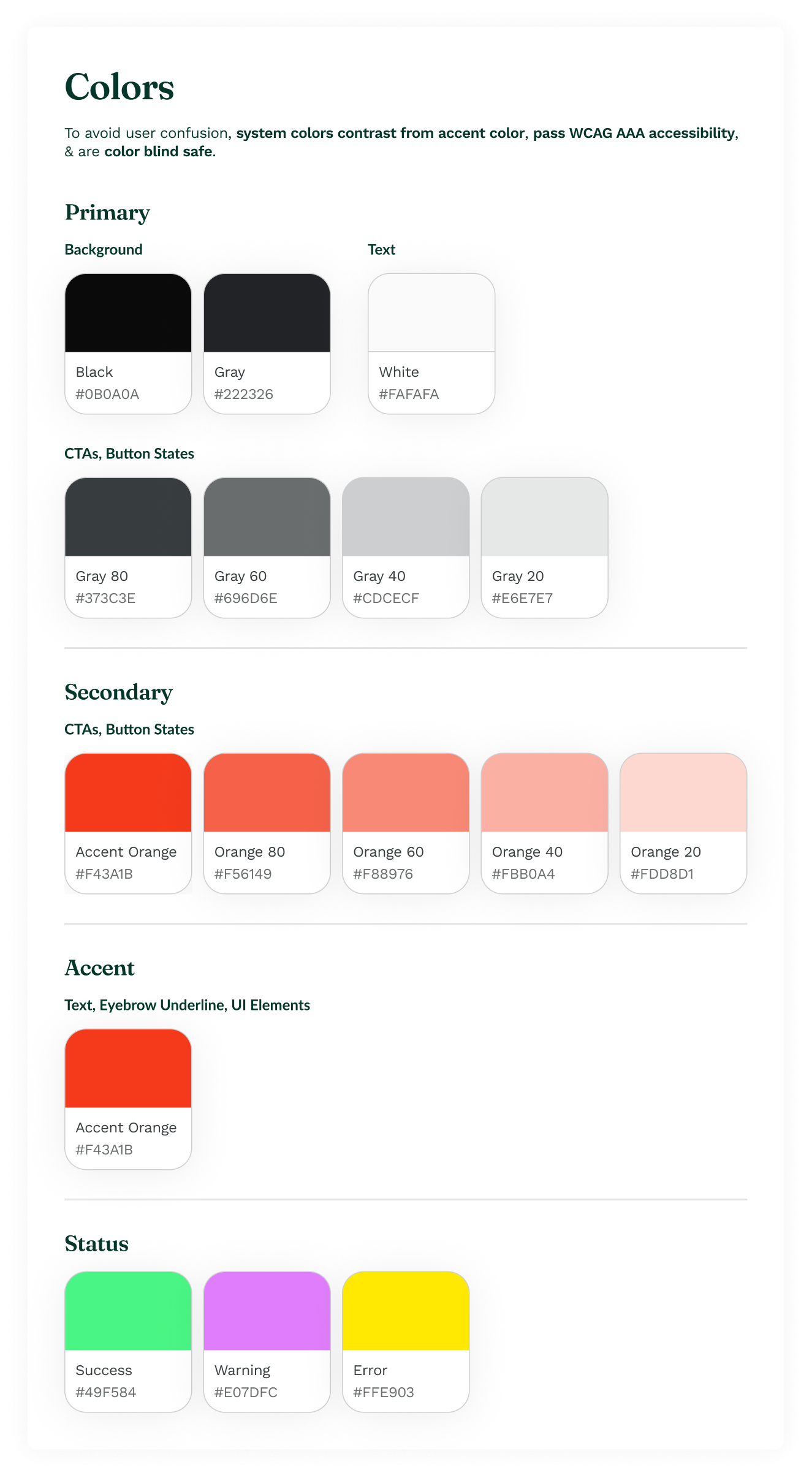
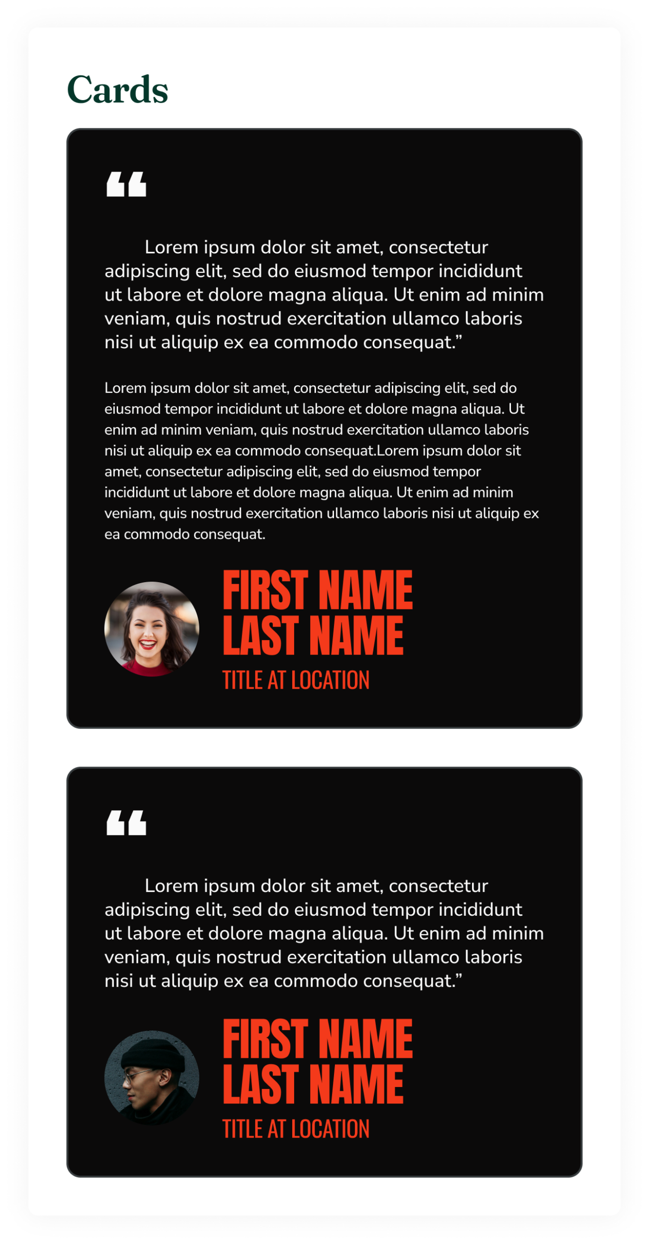
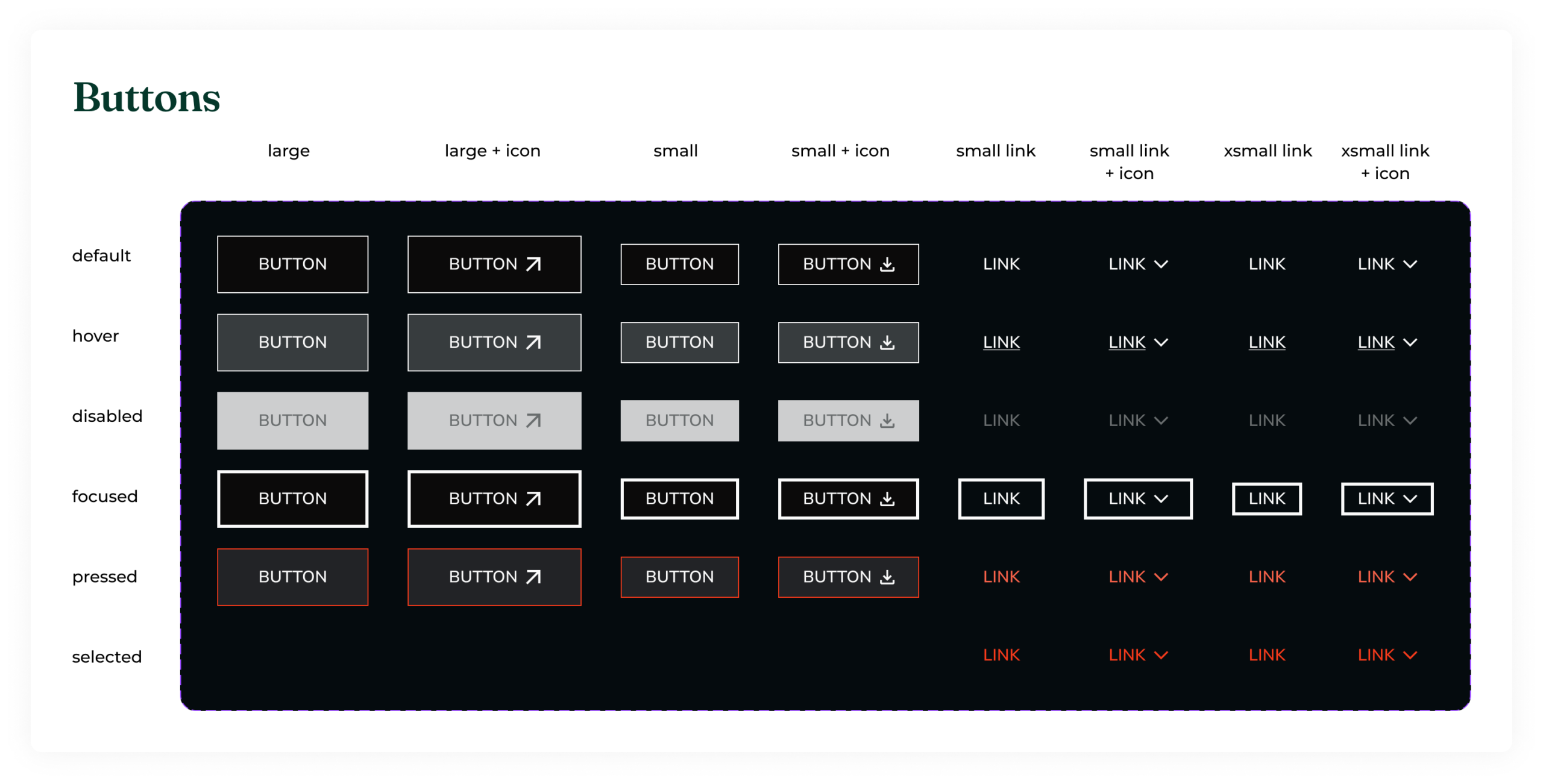
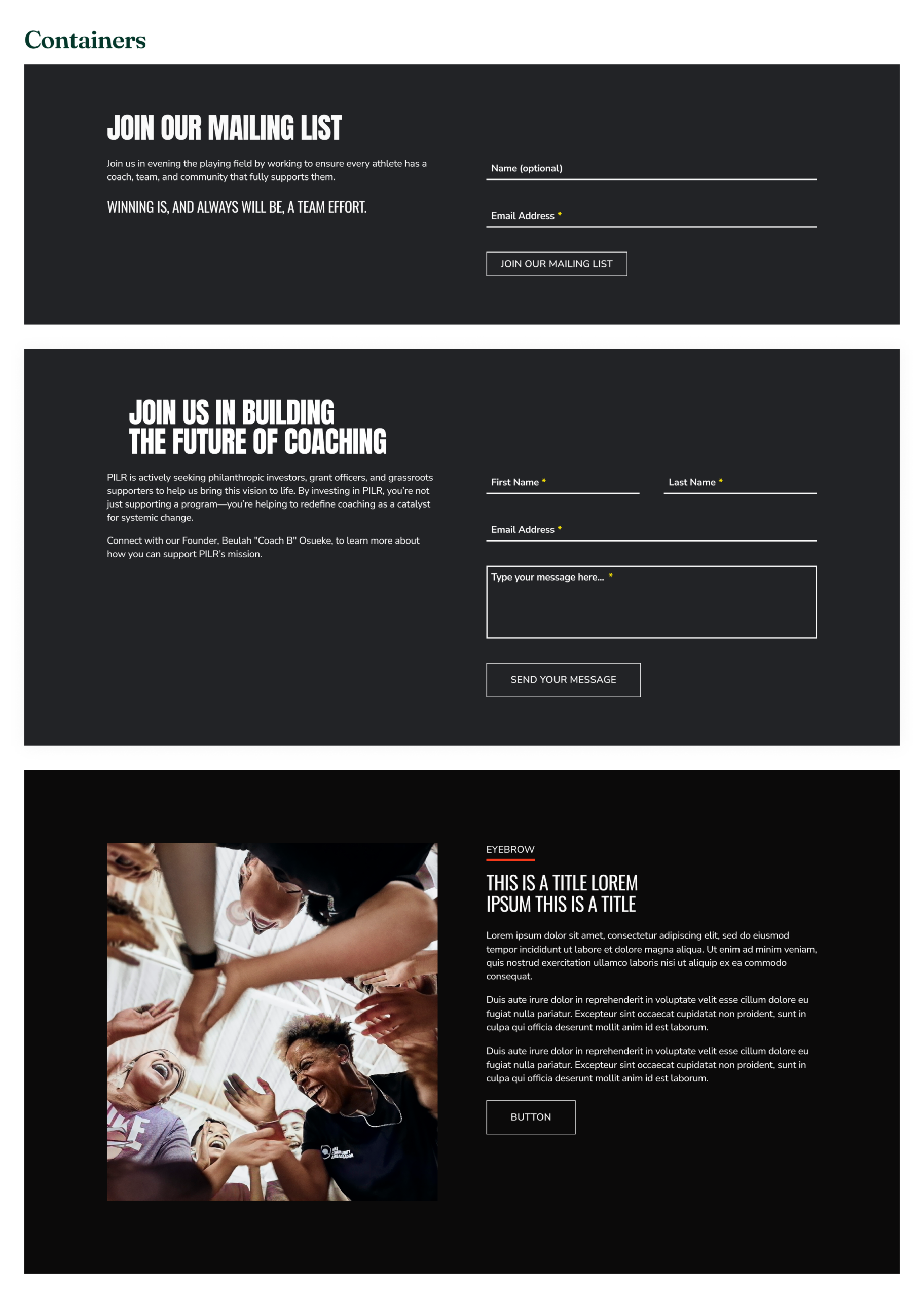
DESIGN SYSTEM
Establishing a Scalable Design System.
We established a design system from the ground up to support a consistent & scalable experience across desktop, tablet, & mobile.
I owned specific components & collaborated with other designers to align patterns & ensure consistency across states + edge cases. This enabled us to scale from 3 to 6 pages without slowing development.
Components I Owned
IMPACT
Enabling Investor Evaluation and Early Action.
Users progressed beyond the homepage into key evaluation pages like Solutions, Team, & Contact—indicating deeper engagement with investor-critical information. Within the first 3 months, the site generated 300+ engagement events & averaged 1.75 pages per user.
Early form interactions suggest users not only understanding PILR’s value, but taking steps to engage.
REFLECTION
Validation, Alignment, and Structure Drive Outcomes.

Aligning stakeholders around investor needs drove key product decisions. By advocating for a phased redesign, I shifted priorities from a full overhaul with animations to a focused update that delivered investor value in time for February outreach.

Structuring the experience as a clear flow enabled action. Moving from a dense pitch deck to an accessible web experience enabled investor engagement & action.
User testing showed that information structure impacts investor evaluation. A single page led to missed financials & roadmap details, while six pages made them accessible.
NEXT STEPS
Clarifying Depth of Evaluation.
While the homepage supports full evaluation, lower traffic to pages like Solutions suggests users may not see the value in exploring further. I would clarify what deeper pages offer & use scroll depth + heatmaps to identify where to better guide exploration.
Let's connect!
© 2026 Natasha Mislang